
Example 1:

Look at the icons, they use a few colors, and although WIN 8 DP uses only one color with black outline for metro icons, you can see that these icons in Whistler also use only use simple lines in their design(no gradients or effects).
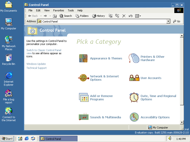
Example 2:


Self Explanatory
Example 3:


Watercolor also shares some design features with WDP basic theme.
What do you guys think about this? Did Microsoft take a few elements of Whistler\Neptune and put them into Windows 8 DP?
(I know metro originated from WMC, but that had a way more glass\aero look)
Offtopic Comment
1 day till Consumer Preview cant Wait!