
Longhorn Days is a set of Macromedia Director demos created by Microsoft to demonstrate the capabilities intended for the Windows "Longhorn" operating system. The name Longhorn Days is from ReflectiaX, when he shared in 2009 screenshots of the demos.[1]
Videos
Portions of the demos appeared in a promo video for PDC 2003, with "Get the Party Started" by P!nk playing in the background.
Stephen Chapman also made two videos based on these demos. These may be accessed here and here. These demos were also used to generate screenshots for patent filings.[2][3]
!["FIG. 9C is a screen shot showing important features available in the application minimized in the sidebar" (Source: US7669140B2 patent)[2]](/wiki/images/thumb/c/cb/US07669140-20100223-D00016.png/120px-US07669140-20100223-D00016.png)
"FIG. 9C is a screen shot showing important features available in the application minimized in the sidebar" (Source: US7669140B2 patent)[2]
!["FIG. 9A is a screen shot showing an open application" (Source: US7669140B2 patent)[2][3]](/wiki/index.php?title=File:US07669140-20100223-D00014.png)
!["FIG. 9B is screen shot showing the application of FIG. 9A minimized in the sidebar" (Source: US7669140B2 patent)[2][3]](/wiki/index.php?title=File:US07669140-20100223-D00015.png)
!["FIG. 9C is a screen shot showing important features available in the application minimized in the sidebar" (Source: US7669140B2 patent)[2]](/wiki/index.php?title=File:US07669140-20100223-D00016.png)
Demos
Heesung Koo
Some demos are available at the website of Heesung Koo, product designer for the Windows team during "Longhorn" development.[4]
The executable files showing how the Basket tile was intended to function were previously available here. The .exe files have been archived by the Wayback Machine. Koo's page detailing how the Basket tile was designed to work (with links to the .exe files) is available here. A demo, bin4.exe, could not be opened. ReflectiaX analyzed its contents and concluded, "I think the file upload of bin4.exe died before it was complete and the client wasn't set to resume failed uploads."[5]
Other demos were also available here, but access to this page has since been forbidden. The .exe files were archived by the Wayback Machine. These demos are:
- bin8.exe - Longhorn Listmaker,
- burn1.exe - Burn to CD wizard,
- e2e photos.exe - My Pictures and Videos (the basic functionality of this is in Windows 10's Photos app, though not the user interface and the auto-rotate function),
- msxday.exe - My Music library,
- tree1.exe - Longhorn Listmaker navigation.
Koo also discussed user interface concepts for dealing with music files. The screenshots and captions are archived below.
ReflectiaX
Other demos, including unused ones, were made available by ReflectiaX and may be downloaded here.
Longhorn Music & Radio Overview by Heesung Koo
These images and their captions were taken from Heesung Koo's website, specifically on his "Longhorn Music & Radio Overview" page,[6] except when otherwise noted.
Acquire
M3
M4 (Partner-WMP) Ownership of specs (per LHMC discussions, next steps are to decide on the actual spec owners and roles for Music, including Acquisition and Playback). Next steps: Drive the specifics. Owner: TonyCh. Usability test planned for grouping algorithm.
— Heesung Koo, Longhorn Music & Radio Overview, [6]

- "Since music place is not a physical space we can promote many virtual views. One we promote here is "most recently added" grouped view where cds users have copied recently are populated."[7]

- "Whenever users insert a cd our default experience is to copy and play it at the same time. We will provide a cue via countdown mechanism where users are given a choice to select other options. If users let it go, we will begin copying once the countdown has expired."[7]

- "Users can see animating CD in most recently added in music library. When users click this album, they can see the detailed status about it."[7]

- "We want to leverage the preview pane to show progress off copying music to shell library. Here we will indicate Which song is being copied and what the overall copy Status is."
- "The status shows which song is playing and copying and how much time it does remain to finish."[7]
First experience
M3
Designed a place holder null select preview pane.
M4 Define first experience in music library with new frame work.
— Heesung Koo, Longhorn Music & Radio Overview, [6]

- "As first experience, we promote most recently add and music library. Most recently added is based on usage pattern we find songs that recently added in users' library."
- "We want to promote three tasks that we want to bubble up to users. These three tasks are not decided yet."
- "If users don't have metadata for thier CD, how do we want to update thier metadata? do we want to do it forground? or background?"[8]

- "Issue: We consider what the best experience to update and get metadata for music. which experience will be forground or background?"
- "Longhorn starts filling in the blanks for meta-data in your music collection automatically."
- "Missing Album art starts filling in, and a list of recently added music is created dynamically"[8]
- "LH music will support auto preset based on users' usage patterns. Most recently added is one of these functions. After we filled up missing metadata, then users can see "most recently added album" from their music library."[8]
Browse/Organize
M3
Music Library - Defined preview pane - Designed list views
M4 (New frame work) Music Library - Define preview pane - Define taks pane - Define filter & pivots - Design list views - Design properties page - Preview song (p2)
M5 - Services Integration - Radio Integration - eHome Integration
— Heesung Koo, Longhorn Music & Radio Overview, [6]
Music library

- "Expose five pinned pivot in music library which are all tracks, all albums, all artists, all playlists, and most recently added. There are more auto preset using usage pattern under more auto-search."[9]
- "open issue: has to decide an appropriate terminology for other pivot -own by stacy lewis"[9]
- "Expose two filters -albums and artist"[9]
- "open issue: where is group by? I assume that group by is with view by, so that user click the icon of view by, users can see both of them."[9]
- "Let user navigate into get songs. double click to open an album"[9]

- "Open issue 1: here is two different opinions that First, we need to have consistent users behavior with all albums and all artists. The reasons is that there is one more tiers, then we have to let user navigate into the second tier. We have to give consistent view like albums. All artists view is supposed to thubmail of artist picture, not expose sub tiers. Then what is this view can be? call by " all in one view" which we add another pivot."[9]
- "Open issue 2: On the other hands, Pivot has individual strength or benefit to present users to be albe to see and do easily and quickly. It doesn't have to keep consistenting behavior this case. Another consideration is we already have enough pivot that user has to understand and use. Do we have to add another pivot which call by "all in one view" which actually this view is that the same presentation of all artists."[9]

- "Now in LH build you can see that it shows all sub catagories under genre, year, size and duration. Even though the catagories are different here. In music UX team will decide what we think to be filter lists here."[9]
- "open issue: is it better to show sub catagories in drop down? or if this is MRU, then users choose one of filters, show the sub catagories under it."[9]
- "The default will be albums and artist, but the filter area will be MRU, so that it will be changed whatever you used recently."[9]

- "The default will be albums and artist, but the filter area will be MRU, so that it will be changed whatever you used recently."[9]
- "open issue: is it better to show sub catagories in drop down? like LH Build has the function now. If the lists are so long, is it an appropriate choice to present to user? or if this is MRU, then users choose one of filters, show the sub catagories under it."[9]
Preview pane

- "Open issues: how do we want to expose contextual tasks with related to more tasks and general tasks with related to more tasks. Do we want to put togehter all more tasks that it doesn't matter what the tasks are involved in such as contextual or general. Terminology has to defined, if we will seperate two different tasks."[10]
- "This design presents that more activities will show all other tasks both of contextual and general tasks."[10]

- "Open issues: how do we want to expose contextual tasks with related to more tasks and general tasks with related to more tasks. Do we want to put togehter all more tasks that it doesn't matter what the tasks are involved in such as contextual or general. Terminology has to defined, if we will seperate two different tasks."[10]
- "It presents that we might be seperate "more activities" to present more contextual tasks and other tasks using different location and term. Terminology has to be defined in this case differently."[10]
Playback
M3
M4 (partner-WMP) Define UI on playback - from preview - from list views - from bar parts - from list maker - ehome intergrarion
— Heesung Koo, Longhorn Music & Radio Overview, [6]
Music library / first experience
- "The player is docked to the bar by default allowing for easy access to music while doing other things."[11]

- "When users start to play music, it will display album art and album title. Also the title line will animate horizontally to show between song title and album title."[11]

- "In LH media player is optimized for playback experience with the ability navigate through music collections in a light way. Here users can change my play list to others such as auto playlist, albums, or etc."[11]

- "Users can easily and quickly replace music through flyout from docked player in sidebar."[11]
Find songs/albums like this / Soundslike

- "This allows users to select an album and click on a task "show me all music that sounds like this:, and we will return user with a rich view of all albums in his computer that are similar to the album selected."[12]
- "Size and proximity to the selected album indicated how similar the albums are relative to each other."[12]

- "There is an easy to use slide bar that users can use to adjust the total time. This can be a useful function when user is on the go and wants to quickly transfer music to a device like mp3 that have storage constraints."[12]

- "Users also can save this view as a playlist."[12]

- "You can browse here richly by clicking on any albums and again LH will return users with similar albums by the selected album."[12]

- "User can also scope to all media content similar/related to the selected album."[12]

- "Here we are pulling from contents available from variety of services such as WM.com, where users will be returned with everything from albums they don't have to music videos available by the artist."[12]
Soundslike
M3
M4
M5 - Define Soundslike and relationship view - Soundslike (for “content from the cloud”) - Integration for (for “content from the cloud”) LH Picture PLace - Design edit UI
— Heesung Koo, Longhorn Music & Radio Overview, [6]
Goals
Create a rich, interactive, special view that:
- Allows users to find and interact with music to collect and listen in Windows in useful and attractive ways.
- Let users enjoy to gather and save similar music using metadata and virtual folder.
- Make users excited as a new, fresh, visual richness and intuitive interaction with their music.
User Problem
- Users problems for finding and gathering similar music currently spend a lot of time and efforts they have to think about where to go to search those stuff. Users have to make a decision based on what they are looking for. However it is very difficult to identify the similar music that I like.
Design Goals and Benefit
In my collection
Finding and collecting music quickly music I want Recently Toby often changes a music collection to his device. It is much faster and easier to do it, because he uses "Soundslike" to collect the music that he likes and copy to device. He selects Nina Hagen and Alanis. Soundslike will collect the similar music that start with Nina Hagen and end with Alanis. He is amazing how it collects the music. Also the music is automatically ordered when Toby saves as playlist and send it to his device.
Browsing collection with fun: order and save music easily and quickly Toby loves to browse and collect music with Soundslike, because it helps him to find and collect his favorite style of music putting together very easily and quickly. Also he enjoys to reorder the collections by size, duration,and using filter such as genre, mood, decade, and etc. He could transfer a new playlist to his device much faster and easiler while he was saving as a playlist in soundslike. He is also amazed that the list is automatically ordered by similarity. The soundslike would be a useful function when user is on the go and wants to quickly transfer music to a device like mp3 that have storage constraints. There is an easy to use slide bar that users can use to adjust the total time, size, and etc.
The soundslike provides rich presentation and direct manipulation interaction Size and proximity to the selected items indicated how similar the contents are relative to each other. Users will see a rich view of the contents in their computer that are similar to the selcted item. They can browse the current contents richly by clicking on any contents and again LH will return users with similar albums by the selected one.
With Service
The soundslike is easy and fun to discover a new artist, album, music video, live concert video, interview, and radio station Uers can also scope to all media content similar/related to the selected item. The interaction to find, collect, discover, and get information for music is very smooth, fun, and dynamic. People will be amazing how Lonhorn is smart and fills user's desire up. Uers could eaily expand their knowledge of new music market that they are interested in.
The soundslike uses audio fingerprint technology. The Soundslike allows to find and browse for a similar music based on metadata. Through MSN techology to find a similar music that it would find to match the following;style-subgenre-genre-vocal code(gender) such as male, female, M & F duet, or nothing, and mood and rhythm. It would scan 128 elements and match to find similarity. DMD-AMG is looking for similarity based on album level, not track level. This is looking for Genre-subgenre-style. If you want to know more detail information, please contact John Platt. He works for MS reseach.
— Heesung Koo, Soundslike, [13]
Design explorations
Concept 1
Concept 2: What would be the essential tasks in the tool bar? preview a song/album, add to now playing, burn to a CD, save as a playlist or smart playlist? do we need a preview pane?


Music playlist
Music Playlist
M3 music playlist - Designed UI for static playlist - Heurastic evaluation and small group of usability test
M4 - Playlist creation and editing - Playlist basket tasks - Define final UI design for static playlist - Define what smart (dynamic) collection is (simple query scenarion)
M5 - CD/ DVD burning - Smart (dynamic) collection (complex query)
— Heesung Koo, Longhorn Music & Radio Overview, [6]
Listmakers and bin
Design progress:
Design a simple, quick, and easy way to collect groups of items. LH allows users to perform a batch operation on multiple files quickly.
This demo demonstrates the concept of the bin's behavior on the sidebar and where the entry point could be.
It indicates that the bin is on the sidebar, and how to behave.
It demonstrates the first experience with the basket.
This demonstrates like the way in the media frame demo http://msrweb/nextmedia/LH%20MediaFrame%20Final.wmv that their baskets stay the same size, and the thumbnails just get smaller. Users cannot interact items in the basket, but the flyout can show the full list of items that users can customize.
— Heesung Koo, Listmakers & bin, [14]
Bin overview
Goals
Design a simple, quick, and easy way to collect groups of items that:
- Let users collect multiple items and execute 'batch' commands on those items in more useful, convenient ways.
- Overcome current user hurdles with multi-selection.
- Offer Bin compatibility across multiple content areas and programs.
- Debut a fresh, new, and intuitive design that will engage users and showcase Longhorn innovation.
User Problem
Users need to be able to print, mail, save, share, or in some way apply the same command to multiple files at once. To do this in XP, items must be in the same folder (not convenient) and the user must know how to use
ctrl+select(not intuitive).Design goals
Allows users to perform a batch operation on multiple files quickly. Simple: No extraneous dialog pop up; offer in place confirmation instead; allow access to help right in the bin, offer bin history, current contents, and auto save the content. Fun and Engaging: The bin will offer light weight UI appeal. Interactions will be surprising and fun, such as cute noises when you tear the bin off and move it on your screen. Useful: The bin will be so handy and time-saving that people will use it everyday.
- Independent of file location
- Without requiring a special keystroke for selection of physical objects
- Without repetition
- In a natural way that mimics"real world" selection of physical objects
- In a way that lets users casually organize and assess contents without feeling "committed"
- Discoverability: knowing how to get to the bins what auto saved and where the item is.
- Interaction: Drag and drop items, resize, detach and attach the bin from windows.
- Conceptual model: list items aren't actual files, they're shortcuts or pointers. Putting them in the bin is not copying or moving; deleting the bin doesn't delete actual items. it is only remove the file from bin.
Issue:
- Will we allow multiple bins or limit to one bin? multiple bin? when, for example, when a user opens one bin then navigates around to a different area and clicks the bin option again, will the first bin come forward with its contents, or will a new, empty bin open? And if we do allow multiple bins, will the second bin open as empty by default, or will it start with the previous bin's contents? (In case the user didn't realize they started a second instantiation?)
- Do we need a confirmation dialog?
- Do users want to get an easy access to help, history, and current contents in place? Are they interested in looking for burn lists that I created three days ago?
Design benefit
What makes the bin so much better is that it's a holding area that;
- collects multiple file types
- spans multiple programs (so Toby can go from his playlists to Kazaa to another app until he gets his CD just right)
- spans multiple content areas (so a user can collect photos from e-mail attachments, photo/video folder, web site/share, other virtual folder and then pull them into power point or slide show, etc.)
Scenario
Patrick is going on a business trip so he uses the bin to collect the materials he'll want to print as handouts. He drags several Word documents, an Excel spreadsheet, and a power point slide show into the bin. He saves the list as a virtual folder for later reference, and then clicks "Print" for hard copies of all the items.
Toby wants to make a CD for his girlfriend. He browses his music collection looking for just the right songs. As he comes across an item he wants, he drags it into the bin. When he's done browsing, he drags the songs into the order he wants and then clicks "Burn to CD."[how do we make this better/different than listmaker?????]
Abby wants to make 12-month calendars as Christmas gifts for her grown daughters. She uses the bin to collect and assess photos she will consider. Once the list is narrowed down to 12, Abby clicks the "Slide Show" button to create a slide show and see how the photos will look in order. Once one calendar list is created, Abby saves the list and then swaps out some photos to personalize it for the other recipient. [is this markedly better/different than photo listmaker?]
Decisions: Ponder more about quick and simple, useful feature that is very assertive and visible throughout the Longhorn experience. Definitely it would be users everyday activities, so when users see and use everyday they should satisfy the value and worth with this feature.
Which tasks will we afford in the bin? We think we should support all execute tasks, but we explore a different UI experience simple tasks (collect+save)vs. complex tasks(collect+share).
- Printing
- Burning to a CD
- Creating a playlist
- Making a slide show
- Saving as a virtual folder
- E-mailing
Detail feature Goals
Functional goals:
Implementation goals:
— Heesung Koo, Playlist bin, [15]
!["Entry point: next to the favorite, on the sidebar, start menu, or the task in the preview pane"[15]](/wiki/images/thumb/d/d6/Bin3.jpg/120px-Bin3.jpg)
"Entry point: next to the favorite, on the sidebar, start menu, or the task in the preview pane"[15]
!["Entry point: next to the favorite, on the sidebar, start menu, or the task in the preview pane"[15]](/wiki/images/thumb/d/d3/Bin6.jpg/120px-Bin6.jpg)
"Entry point: next to the favorite, on the sidebar, start menu, or the task in the preview pane"[15]
!["Basket behavior: it is smart to know where the basket would appear. If users put the basket on the sidebar, it would always open on the sidebar. If windows opens the right corner of windows, it would open the other side windows."[15]](/wiki/images/thumb/1/12/Bin5.jpg/120px-Bin5.jpg)
"Basket behavior: it is smart to know where the basket would appear. If users put the basket on the sidebar, it would always open on the sidebar. If windows opens the right corner of windows, it would open the other side windows."[15]
!["Basket UI design: Users can easily find previous collections and get a help while collecting items if they have a trouble. Also users are able to see the preview of executive contents."[15]](/wiki/images/thumb/6/60/Bin4.jpg/120px-Bin4.jpg)
"Basket UI design: Users can easily find previous collections and get a help while collecting items if they have a trouble. Also users are able to see the preview of executive contents."[15]
!["Basket UI design: Users can easily find previous collections and get a help while collecting items if they have a trouble. Also users are able to see the preview of executive contents."[15]](/wiki/images/thumb/5/5d/Bin8.jpg/120px-Bin8.jpg)
"Basket UI design: Users can easily find previous collections and get a help while collecting items if they have a trouble. Also users are able to see the preview of executive contents."[15]
!["Basket UI design: executive process...it could be happened in place. The bin would provide three taps to quick and easy access to help, history, and bin."[15]](/wiki/images/thumb/f/f8/Bin7.jpg/120px-Bin7.jpg)
"Basket UI design: executive process...it could be happened in place. The bin would provide three taps to quick and easy access to help, history, and bin."[15]
!["Basket UI design: executive process...it could be happened in place. The bin would provide three taps to quick and easy access to help, history, and bin."[15]](/wiki/images/thumb/9/99/Bin9.jpg/120px-Bin9.jpg)
"Basket UI design: executive process...it could be happened in place. The bin would provide three taps to quick and easy access to help, history, and bin."[15]
!["Basket UI design: executive process...it could be happened in place. The bin would provide three taps to quick and easy access to help, history, and bin."[15]](/wiki/images/thumb/9/91/Bin10.jpg/120px-Bin10.jpg)
"Basket UI design: executive process...it could be happened in place. The bin would provide three taps to quick and easy access to help, history, and bin."[15]
!["Basket UI design: two baskets on the sidebar (fixed) and the bin slides out from windows(moving freely). Do users understand how they can use two baskets? are they the same one? two baskets could sense the contents each other. On contrast, if it is two different independent baskets?"[15]](/wiki/images/thumb/3/36/Bin1.jpg/120px-Bin1.jpg)
"Basket UI design: two baskets on the sidebar (fixed) and the bin slides out from windows(moving freely). Do users understand how they can use two baskets? are they the same one? two baskets could sense the contents each other. On contrast, if it is two different independent baskets?"[15]
!["Entry point: next to the favorite, on the sidebar, start menu, or the task in the preview pane"[15]](/wiki/index.php?title=File:Bin3.jpg)
!["Entry point: next to the favorite, on the sidebar, start menu, or the task in the preview pane"[15]](/wiki/index.php?title=File:Bin6.jpg)
!["Basket behavior: it is smart to know where the basket would appear. If users put the basket on the sidebar, it would always open on the sidebar. If windows opens the right corner of windows, it would open the other side windows."[15]](/wiki/index.php?title=File:Bin5.jpg)
!["Basket UI design: Users can easily find previous collections and get a help while collecting items if they have a trouble. Also users are able to see the preview of executive contents."[15]](/wiki/index.php?title=File:Bin4.jpg)
!["Basket UI design: Users can easily find previous collections and get a help while collecting items if they have a trouble. Also users are able to see the preview of executive contents."[15]](/wiki/index.php?title=File:Bin8.jpg)
!["Basket UI design: executive process...it could be happened in place. The bin would provide three taps to quick and easy access to help, history, and bin."[15]](/wiki/index.php?title=File:Bin7.jpg)
!["Basket UI design: executive process...it could be happened in place. The bin would provide three taps to quick and easy access to help, history, and bin."[15]](/wiki/index.php?title=File:Bin9.jpg)
!["Basket UI design: executive process...it could be happened in place. The bin would provide three taps to quick and easy access to help, history, and bin."[15]](/wiki/index.php?title=File:Bin10.jpg)
!["Basket UI design: two baskets on the sidebar (fixed) and the bin slides out from windows(moving freely). Do users understand how they can use two baskets? are they the same one? two baskets could sense the contents each other. On contrast, if it is two different independent baskets?"[15]](/wiki/index.php?title=File:Bin1.jpg)
Music playlist M4

- "When users click a task " Create a playlist," it will launch another window."[16]

- "This design focuses on as simple as possible to create a playlist. Pivot and fiter will be closed as default. Also breadcrumb is more closed in music library. This is a different frame design with main one."[16]
- "expose preview song-it will preview a song that a specific area of the song 10 sec."[16]

- "Basket is oriented vertically."[16]
- "Pivot and filter will be closed as default."[16]
- "User can select items and click add to list, drag and drop."[16]
- "User can select items and copy/paste,or drag/ drop from another folder"[16]
- "If user has already selected items before clicking create a playlist, the selected items will be populated in the basket."[16]
- "Items animate into the basket. Also selected items will change text color to indicate user which one they selected."[16]
- "In the basket, users can see how many songs in the basket and duration also."[16]
- "It has "move up and down" and "delete."[16]
- "expose preview song-it will preview a song that a specific area of the song 10 sec."[16]

- "Users can click an album art to select all tracks in the album."[16]
- "Users can preview the selected song with the task "preview a song.""[16]
- "User can select items and copy/paste,or drag/ drop from another folder."[16]
- "What happen when users double click?"[16]
- "add music to basket?"[16]
- "start to playing music in transport player?"[16]
- "start to preview music in transport player?"[16]

- "After users select items in the basket, you can see we support a default title for this playlist."[16]
- "Also selected items will fade out text color to indicate user which one they selected."[16]
- "Users can see the number of songs and duration."[16]

- "Open pivot and filter."[16]
- Also selected items will fade out the text color to indicate user which one they selected."[16]

- "User can change other pivot."[16]
- "Also selected items will fade out the text color to indicate user which one they selected."[16]
- "User change pivot "All in one" to "Most frequently played."[16]

- "User change the pivot "Most frequently played."[16]
- User can select items and click add to list, drag and drop."[16]
- User can select items and copy/paste,or drag/ drop from another folder."[16]

- "Users can select items will fade out the text color to indicate user which one they selected."[16]
- "User can select items and click add to list, drag and drop."[16]
- "User can select items and copy/paste,or drag/ drop from another folder."[16]

- "Users can select items will fade out the text color to indicate user which one they selected."[16]
- "User can select items and click add to list, drag and drop."[16]
- "User can select items and copy/paste,or drag/ drop from another folder."[16]
- "Users can see the number of songs and duration."[16]

- "Also selected items will fade out text color to indicate user which one they selected."[16]
- "Users can see the number of songs and duration."[16]

- "Also selected items will fade out text color to indicate user which one they selected."[16]
- "Users can see the number of songs and duration."[16]
- "Users can move up and down as well as delete the song."[16]

- "After users delete the song, they can see the order will update."[16]
- "Users can see the number of songs and duration."[16]

- "Users can rename the playlist instead of a default title."[16]

- "After users rename the playlist and save it, we will send users where the new playlist is."[16]
- "Users can see the content of the new playlist easily."[16]
- "Users can do other activities with the new playlist in this place."[16]
Device
Share
M3
M4
M5 - Integration with Devices - Show interaction on Device - Show how Audiotron devices use same music collection and filters/playlists. - Synch music we could (location: bar part, preview like copying CD) New Playlist(s) New CD(s) New Preset(s) Currently playing+queue on PC Album art+ rich metadata
— Heesung Koo, Longhorn Music & Radio Overview, [6]

- "Home media devices become great PC peripherals with Longhorn."[17]
- "Plug in any digital audio device."[17]

- "Synch music we could (location: bar part, preview like copying CD)-assume enough storage for whole collection"[17]
"New Playlist(s) New CD(s) New Preset(s) Currently playing+queue on PC Album art+ rich metadata"[17]

- "Show interaction on Device (Q: Is the device UI the same as Window eHome?)"[17]
- "Playing the song you were listening to on your PC (queue)"[17]
- "Picking another song to play"[17]

- "While you are synching up your music to your device, you can see the indication on the sidebar. When users click it, the flyout will show the contents that are synching up now."[17]

- "When users go out to part to listen music through thier device. However, they find that some songs are unable to play, so that they want to connect their computer to get these songs again."[17]

- "unable to play some songs."[17]

- "They connect their computer to get these songs again."[17]

- "Show how Audiotron devices use same music collection and filters/playlists. show their UI with the Longhorn music collection"[17]
Virtual folders

- "Users click all songs pivot LH will return user with flat list of all of their songs with ability to sort the collection easily."[18]

- "We also want to promote usage patterns such as most frequently played."[18]

- "All artist view is optimized around using groupings to contain all albums users have on the artist."[18]
- "When users click the group title, it will be selected all albums under artist."[18]

- "If users want to select all songs then they can select either album title or album artist. Also they can drag and drop albums or songs in the player."[18]
- "Users can select the group header to select all albums and add these albums to currently playing play list."[18]

- "Users can also choose to use the search field to essentially query on their music collection."[18]
- "Here I typed 'n'. I conveniently get an artist view of 'n'. (below images of all artists 4, 5)"[18]

- "Users can also choose to use the search field to essentially query on their music collection."[18]
- "Here I typed 'ni'. I conveniently get an artist view of N. (below images of all artists 4, 5)"[18]

- "Users can also choose to use the search field to essentially query on their music collection."[18]
- "Here I typed Nina for Nina Hagen. I conveniently get an artist view of Nina."[18]
Photo & Video E-mail Experience
Photo & Video E-mail Experience
User Problem Users need to be able to send photos and videos much easier than current XP experience. Some users have a difficult time to find the entry point of send their photos and videos. Also most people don't know how they will resize or compress their pictures and video, so people couldn't send multiple pictures or videos to their family and friends at once.
Design goals Design a easy, simple, and useful: E-mailing experience in LH will be consistent wherever users started with. This consistent UI experience has obvious advantages: Allow users to send photos and videos more intuitively. Easy: Users don't have to reduce photos and videos file size with any applications. LH will provide users greater access and speed as they can send files. Simple: The simple and rich visual impact of the new design presentation will make users feel more fresh, exciting, and engaging. Useful: Users don't have to worry about sending multiple photos and videos to their family and friends anymore. It is very easy to produce multiple pictures and videos as small as possible.
- Allow users to send photos and videos more intuitively:
- In a natural way that understand "send mail" with their files easily and quickly
- In a way that lets users send multiple files without feeling "committed"
- Overcome obvious challenges for the user that they are worried about sending a big file size or big multiple files.
- The new UI design will present rich visual impact with users' selections that make users feel excited and fun to send their pictures and videos to family and friends.
Decisions: It will not only provide a better user experience , but more importantly, it will make users satisfied the communication experience with their friends and family much richer, simpler, and easier than XP. This feature will also present that users will send their stuff much quicker and simpler without committed feeling. This new UI design will be very assertive and visible to users. Definitely it would be very useful to users everyday activities. When users see and use everyday they should satisfy the value and worth with this feature.
— Heesung Koo, Photo & Video E-mail Experience, [19]
Overview design


"You can see current design explorations: \\opaque\secure\heesungk\send mail\JPG - I will upload all design explorations on MSX design site by next week. If you don't have an access for \\opaque\secure, You should wait until I upload MSX site. I am sorry for inconvenient."[19]
Basket on the sidebar
- Note: Not all images have been archived, and only thumbnails have been archived. Captions for the unarchived thumbnails are available at the Wayback Machine page.
!["Sidebar basket 1" (Source: Heesung Koo)[20]](/wiki/index.php?title=File:Music_sidebar_flyout01.jpg)
!["Sidebar basket 2" (Source: Heesung Koo)[20]](/wiki/index.php?title=File:Music_sidebar_flyout02.jpg)
- "This design focuses on a consistence of sidebar behavior."[20]
- "The flyout will show the contents of collections with tasks that user can do with contents."[20]
- "User can select items and drag and drop to the basket."[20]
- "When users select an item, the flyout will close. So users have to target on the title of basket# that they want to put the item in. Items animate into the basket."[20]
- "What happen after executing the task?"[20]
- "the collection would be gone?"[20]
- "do we give the prompt that users want to save the basket?"[20]
- "do we autosave the basket like history that users can do other things with it again?"[20]
- "do we want to allow the basket to be able to undock?"[20]

- "The basket is on the sidebar. It is different design approach rather than a consistent behavior on the sidebar. The reason is that the flyout is not staying to open while users collect items. it would be annoying users collect. Also users would a difficult time to make a target of basket# or name correctly to put things in the basket. This design demonstrates the basket and tasks expose on the sidebar instead of flyout."[20]
- "The flyout will show "baskets" that users still hold, not execute those yet. These baskets are called "live basket." see spec"[20]
- "Definition: temporary basket: holding area for users to collect items on which they wish to perform a common task."[20]
"live basket: a temporary basket that the user is interacting with (i.e. a basket that contains items, or is awaiting items)"[20]
"current basket: the basket whose items and title are being displayed"[20]
- "Basket is not the final name for the feature. It is an internal name."[20]

- "To make the basket more visible and discoveralbe to users, the basket interact with a user's behavior within the shell. For example, when a user select an item, the basket would show the item faded or inactive in the basket. If a user clicks "drag and drop here." The item is animating to the basket."[20]
- "User can select items and copy/paste,or drag/ drop from another folder"[20]
- "Items animate into the basket."[20]
- "Also selected items will change text color to indicate user which one they selected."[20]
Other images


Implementation
Build 4015 has a playlist maker, which Melcher of BetaArchive observed is similar to the images in Heesung Koo's discussion about Music playlist M4.[21]

My Documents from build 3706 Media Center Edition, note UI similarities with the images from the demos
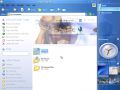
My Music from build 3706 Media Center Edition
My Pictures from build 3706 Media Center Edition
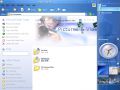
My Documents from build 3713, note UI similarities with the images from the demos

My Pictures from build 3713
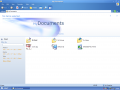
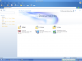
My Documents from build 4002, note UI similarities with the images from the demos
My Music from build 4002
My Pictures from build 4002

Stacks in Music Library in build 4008. Note the quick links at the left and compare with the screenshots from the demos above.


References
- ↑ ReflectiaX (19 September 2009). Unseen Windows Longhorn UI Screen Shots. Retrieved on 12 April 2021.
- ↑ 2.0 2.1 2.2 2.3 David A. Matthews, Charles Cummins, Justin Mann, Judson Craig Hally, Mark Ligameri (21 August 2003). System and method for providing rich minimized applications. Google Patents. Retrieved on 31 March 2022.
- ↑ 3.0 3.1 3.2 True meaning of RMA. Longhorn.MS. Retrieved on 31 March 2022.
- ↑ Koo, Heesung. ResumeKoo.pdf. heesung.jctsolution.com. Archived from the original on 28 August 2019. Retrieved on 3 April 2022.
- ↑ ReflectiaX (13 January 2018). Re: Longhorn Director demos. Retrieved on 9 April 2021.
- ↑ 6.0 6.1 6.2 6.3 6.4 6.5 6.6 6.7 Koo, Heesung. Longhorn Music & Radio Overview. Archived from the original on 1 March 2021. Retrieved on 3 April 2022.
- ↑ 7.0 7.1 7.2 7.3 7.4 7.5 7.6 7.7 Koo, Heesung. copy CD. Archived from the original on 1 March 2021. Retrieved on 3 April 2022.
- ↑ 8.0 8.1 8.2 8.3 8.4 8.5 Koo, Heesung. First experience. Archived from the original on 1 March 2021. Retrieved on 3 April 2022.
- ↑ 9.00 9.01 9.02 9.03 9.04 9.05 9.06 9.07 9.08 9.09 9.10 9.11 9.12 9.13 9.14 9.15 Koo, Heesung. Music library. Archived from the original on 1 March 2021. Retrieved on 3 April 2022.
- ↑ 10.0 10.1 10.2 10.3 10.4 10.5 Koo, Heesung. Preview pane. Archived from the original on 7 April 2021. Retrieved on 3 April 2022.
- ↑ 11.0 11.1 11.2 11.3 11.4 11.5 11.6 11.7 Koo, Heesung. Docked player. Archived from the original on 1 March 2021. Retrieved on 3 April 2022.
- ↑ 12.00 12.01 12.02 12.03 12.04 12.05 12.06 12.07 12.08 12.09 12.10 12.11 12.12 Koo, Heesung. Find songs/albums like this. Archived from the original on 7 April 2021. Retrieved on 5 April 2022.
- ↑ 13.00 13.01 13.02 13.03 13.04 13.05 13.06 13.07 13.08 13.09 13.10 Koo, Heesung. Soundslike. Archived from the original on 1 March 2021. Retrieved on 3 April 2022.
- ↑ Koo, Heesung. Listmakers & bin. Archived from the original on 1 March 2021. Retrieved on 12 April 2022.
- ↑ 15.0 15.1 15.2 15.3 15.4 15.5 15.6 15.7 15.8 15.9 Koo, Heesung. Playlist bin. Archived from the original on 4 May 2021. Retrieved on 12 April 2022.
- ↑ 16.00 16.01 16.02 16.03 16.04 16.05 16.06 16.07 16.08 16.09 16.10 16.11 16.12 16.13 16.14 16.15 16.16 16.17 16.18 16.19 16.20 16.21 16.22 16.23 16.24 16.25 16.26 16.27 16.28 16.29 16.30 16.31 16.32 16.33 16.34 16.35 16.36 16.37 16.38 16.39 16.40 16.41 16.42 16.43 16.44 16.45 16.46 16.47 16.48 16.49 16.50 16.51 16.52 16.53 16.54 16.55 16.56 16.57 16.58 16.59 16.60 16.61 16.62 Koo, Heesung. music_playlist_m4. Retrieved on 9 April 2021.
- ↑ 17.00 17.01 17.02 17.03 17.04 17.05 17.06 17.07 17.08 17.09 17.10 17.11 17.12 17.13 17.14 17.15 17.16 17.17 17.18 17.19 Koo, Heesung. Device -cell phone & Audiotron. Archived from the original on 1 March 2021. Retrieved on 3 April 2022.
- ↑ 18.00 18.01 18.02 18.03 18.04 18.05 18.06 18.07 18.08 18.09 18.10 18.11 18.12 18.13 18.14 18.15 18.16 18.17 18.18 Koo, Heesung. Virtual folders. Retrieved on 7 April 2021.
- ↑ 19.0 19.1 19.2 19.3 Koo, Heesung. Photo & Video E-mail Experience. Archived from the original on 9 April 2021. Retrieved on 7 April 2022.
- ↑ 20.00 20.01 20.02 20.03 20.04 20.05 20.06 20.07 20.08 20.09 20.10 20.11 20.12 20.13 20.14 20.15 20.16 20.17 20.18 20.19 20.20 20.21 20.22 Koo, Heesung. Basket on the sidebar. Archived from the original on 7 July 2021. Retrieved on 12 April 2022.
- ↑ Melcher (25 May 2017). 4015 playlist maker. Retrieved on 7 April 2021.
See also
BetaArchive forum
- Unseen Windows Longhorn UI Screen Shots
- More Longhorn UX thingy stuff.
- Longhorn Director demos
- Longhorn Days retrospective: UX vision vs. reality