Higher Resolution Microsoft Windows Fall 1983 logo

Discussion of beta and abandonware topics not fit for the other forums goes here.
Post Reply
JustZisGuy
Posts: 271
Joined: Wed Dec 11, 2013 3:24 am

Higher Resolution Microsoft Windows Fall 1983 logo

Post by JustZisGuy »

Figure someone here might know, I was wondering if there was a higher resolution version of this logo anywhere:
Image

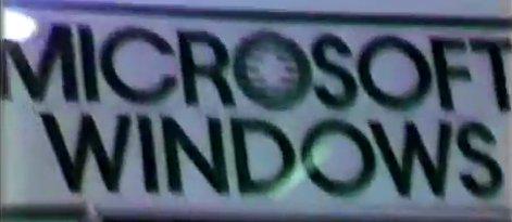
Specifically, with both the "Microsoft" logo and "Windows" right underneath it.

There are some larger cleaned up logos of just the blibbet "Microsoft" logo floating around, but most of the Windows 1.x stuff seems to have the word "Windows" as a smaller, separate, word.

If nothing else, what font is that, so I can add the word "Windows"?

TinaMeineKatze
Posts: 108
Joined: Fri Jan 27, 2017 9:35 pm
Location: Germany

Re: Higher Resolution Microsoft Windows Fall 1983 logo

Post by TinaMeineKatze »

This is the logo used from 1982 — 1987.

You may find it with Google:

https://www.google.de/search?q=1982+mic ... 40&bih=694

Image

(Source: https://cnet3.cbsistatic.com/img/RrJ6eW ... o_1982.jpg )

The windows-logo is just a normal sans-serif font (though I'd be interesting to know which one exactly).

Derf
User avatar
Donator
Posts: 3943
Joined: Sun Jan 27, 2008 8:09 pm
Contact:

Re: Higher Resolution Microsoft Windows Fall 1983 logo

Post by Derf »

That font is a variant of ITC Avant Garde Gothic.
https://www.myfonts.com/fonts/itc/avant-garde-gothic/

marceg16579
Posts: 242
Joined: Tue Oct 28, 2014 7:06 pm
Location: Italy

Re: Higher Resolution Microsoft Windows Fall 1983 logo

Post by marceg16579 »


JustZisGuy
Posts: 271
Joined: Wed Dec 11, 2013 3:24 am

Re: Higher Resolution Microsoft Windows Fall 1983 logo

Post by JustZisGuy »

For whatever it is worth, bold AvantGarde Md BT comes close enough for the "WINDOWS" text, although it is a little thinner and the "R" is much different from the one in "MICROSOFT", so not the same font. Of course, the font does not have the blibbet :P


thunderbird32
User avatar
Posts: 77
Joined: Wed May 10, 2017 9:08 pm
Location: Chicago, IL

Re: Higher Resolution Microsoft Windows Fall 1983 logo

Post by thunderbird32 »

I've always been partial to the 1980 logo. Looks like something off a Metallica album.

Image

It'd be cool to get a vector version of that.

Post Reply